Englishman in New York

It has almost been half a year now. My gig as an assistant professor of data science in population health is taking shape. So far: little teaching, lots of learning, and finding my place in a foreign land. Time for some reflection and some projection.

The Health Campus The Hague is an annex of the Leiden Univeristy Medical Center, where interdisciplinary research is done in the areas of population health management, syndemics, preventive healthcare and lifestyle. People with backgrounds in medicine, behavioral science, epidemiology, nutrition, mental health, data science and much more work together with partners from all over the geographical area of The Hague to lessen differences in health between people. There is no undergraduate education, but there is our Population Health Management MSc program of 2 years. It is a lively environment with a very diverse research agenda and lots of interaction. It’s a lot of fun to work there!

The research agenda is diverse. My research agenda is still fairly non-existent, though, and my only academic experience (astrophysics and learning analytics) is a little bit too far away from population health to be dubbed “relevant”. In essence, that’s not an issue. My direct colleagues and superiors are fine with me taking time to shape my own research agenda, and in the mean time I can flow along with other research projects going on around me. Help with data related skills is often wanted, so I don’t think I will get bored.

I started on a one-year temporary contract that, in case of sufficiency, will become a permanent contract after one year. I in fact already have gotten confirmation that the permanent extension has been approved, so that’s nice. In essence, this is very different from your standard tenure-track career of assistant professors. In the Netherlands it seems that nowadays a permanent contract (“tenure”) became easier, but that is completely unrelated to promotion to associate professorship. Fair enough, a permanent contract is great!

With my research agenda still in the making I also have, contrary to most people in an assistant professor role, no existing research agenda, no publication list, no network of collaborators and no grants to do anything with other people than myself, on my ideas. I can not hire my own graduate students or postdocs, have no travel funds and in fact not even funds for paper charges and those kind of silly things. This is interesting, as I can only shape my own line of research by myself (perhaps with MSc thesis students), as long as it doesn’t cost a thing.

But Marcel, you can just get your own grants? Well, in principle, yes. But. Let’s have a look at most funding agency schemes. First of all, many large grant schemes (here) have a maximum amount of time that you have after obtaining your PhD to get it. That is ages ago for me, of which I spend a decade doing non-academia, so all of those are off-limits. The ones that are available longer after your PhD are, if they can provide enough funds for hiring people, structured such that they basically only fit people who continue their own line of research. I need to build a consortium (typically about 30 people with expertise in the field or in adjacent fields relevant to the proposal), I need to list my N most relevant publications (of which I have zero) and I need to somehow convince them that I can do with the money what I promise to do (which, without any proof, will be extremely difficult).

Therefore, I must conclude that getting my own funds will be hard to impossible. Bummer. Surfing on the waves of others is what it is for me, money-wise. That also means that the work of “my” graduate students will be work in lines of research of others, again not building my own. It seems a bit of a mystery how this line of research is supposed to get shape, as not only do I need to do so alone, but a good part of my time will be spent, necessarily, on the research agendas of others!

And what to think of promotion to associate, let alone full, professorship at some point. Criteria like publication list length, h-index (what if I just publish papers in completely unrelated fields and build an h-index that way, does that count…?) and amount of acquired funding are not quite likely to put me in a reasonable position for any committee judging on my progression.

The Netherlands is trying to push the “Rewards and Recognition” agenda in which other skills/measures than the traditional academic ones (like mentioned) are evaluated to value academic personnel. To me, funding agencies and universities still have a very long way to go before this is properly implemented in all aspects of academic life. I have applied for positions in working groups and committees to work on this, but so far without results. “Diversity” is on their agendas, but it is mostly ethnicity, gender or orientation based, not career based. I’d love to change that, and will keep trying to move myself into position for that!

No more Patreon for me…

Going on with it would mean that from now on, I would need to put some serious time into it, creating a bunch of new material. I have plenty of ideas, but if I create this for only ten people, then why bother? That set me to think: why did this not work? I can think of a bunch of reasons:

  1. It wasn’t as good, fun or original as I thought it was. I tried to come up with angles to the topics that you don’t often see in the other online material, but who knows that this is what people would sign up for?
  2. The audience I was trying to reach was too much of a niche. I aimed at people who already knew some data science, but still were surprised by some of the topics I presented.
  3. I didn’t do enough marketing or advertisement. In the first weeks I spammed a bunch of platforms with it, and basically all of my membership came from that. After that, I sometimes posted teasers every here and there, but when this doesn’t seem fruitful, I get demotivated quickly. (If someone knows how to do this properly, I’d be all ears!)

When I asked my members what they would want to see treated in the episodes, I got requests for two types of things, that I wasn’t going to deliver:

  1. Examples from real life. I have done these things in the wild, but obviously can’t get too specific about use cases, and certainly can’t share the data I have worked with in the past. These are typically sensitive…
  2. Data engineering. Building a model is easy, deploying it isn’t, right? That’s probably right (although I think there is much to gain still in the sciency part, rather than engineering part of data science), but I just don’t enjoy the engineering part that much, so in an experiment for fun, I am not going to treat stuff I don’t like. Stubborn me.

Either way, the journey ends here. The site will go down, the Twitter account will be deleted and I don’t need to worry about finishing content on time anymore. It was fun, I learned more than my members did and at some point in the future I’ll just post all the stuff that I created out in the open on Github. The money my patrons were charged (or what is left of it) will go to open source projects. On to the next adventure!

New laptop, new Linux distro!

I’m a Linux user. Perhaps that should have read “I’m a Linux fan”. At work (for the last 8 years) I was forced to have a Windows workstation, but VMs and my personal laptops have been running Linux since 2001, and so have many of my work computers. Next month, in my new job, I’ll have a Linux machine again! I like it better than Windows, which I have used often for work, since 2013, and some versions of MacOS, which I have used for work while in the US (2010-2013). I’m not quite a distro-hopper, but I do try to switch every once in a while. Getting a new laptop is a great incentive to try something new (I have to install something anyway!) and I happened to get a new private laptop three weeks ago. It’s a Lenovo IdeaPad Gaming 3i. I’m not a gamer, but GPUs have more than one potential use (some specs in the image below). To use it properly, I need to get rid of Windows asap, obviously.

Before, I have used Fedora and RHEL, and a whole bunch of Ubuntu based systems: Ubuntu (until they started Unity), Mint, Kubuntu and Xubuntu. I thought I never was a big fan of GNOME. After my recent purchase, I was struck by the enthusiasm for Pop!_OS that I saw on the web. A distro that is basically just another Ubuntu fork, with some tweaks to the GNOME desktop environment. I was a little bit skeptical, but I was also looking to see what distro I would in September put on my work laptop (and, during work hours, I don’t want to be bothered with stuff that doesn’t work, so I’d rather try it out first). I gave it a try and was planning to try OpenSUSE or some Arch-based distro like Manjaro as well (not that I feel the need to feel very hardcore, but some people are fans, right?). Pop!_OS 21.04 was just out, so I created the bootable USB stick and went ahead. Installation was ultra-easy.

I’m not moving back, nor away! I like the look and feel of Pop!_OS very much and became a fan of a tiling window manager in just a few hours. Only marginal tweaking of default settings was needed for me, and not a lot of bloat-ware was installed (but I did remove vim, HA!). The fact that their desktop environment is called “Cosmic” and that they have a lot of desktop art in that general theme appeals to me as well. One of the really nice things is that they have an iso for computers with NVIDIA graphics, that makes the gpu work basically out of the box. Moreover, you can set the computer to use the internal graphical card (intel) only, the NVIDIA only, a hybrid scheme (internal only doesn’t let you use a second monitor…) or… a setting in which the NVIDIA card is only available for computation. Great for battery life. Also, the seamless integration of apt and flatpaks is quite nice. I feel confident to throw this on the cute Dell XPS 15 that I will get next month and I will likely be up and running in just a few hours. (And then I hope the web-based version of the whole 365 suite will not let me down…because yes, also this employer is quite MS-based in their tooling).

Terminal art, and some hints of what the desktop might look like.

So… Who’s gonna convince me of another distro to try? Suggestions, preferably with some arguments, are welcome!

Using a graphics card for neural networks

Just a short blurb of text today, because I ran into an issue that ever so slightly annoyed me last weekend. I had bought an old second-hand desktop machine lately, because I wanted to try out a couple of things that are not particularly useful on a laptop (having a server to log on to/ssh into, host my own Jupyter Hub, doing some I/O-heavy things with images from the internet, etc.). One more thing I wanted to try was using TensorFlow with a GPU in your machine. The idea was to check out whether this indeed is as simple as just installing tensorflow-gpu (note that in versions newer than 1.15 of tensorflow, there is no need to install CPU and GPU capabilities separately) and the software would figure out itself whether or not to use the GPU.

Then TensorFlow logo, taken from the Wikipedia site linked above.

“TensorFlow is a free and open-source software library for dataflow and differentiable programming across a range of tasks. It is a symbolic math library, and is also used for machine learning applications such as neural networks. It is used for both research and production at Google.‍” (source: Wikipedia)

I use it mostly with the lovely Keras API, which allows easy set-up of neural networks in TensorFlow. I have used it, for example (disclaimer: old code…) in a blog post titled “Beyond the recognition of handwritten digits”.

It turned out that TensorFlow will indeed do this for you, but not with just any graphics card. I have an NVIDIA GeForce GT 620. This is quite an old model indeed, but it still has 96 CUDA cores and a gigabyte of memory. Sounded good to me. After loading tensorflow from a Python session you can have it detect the graphics card, so you know it can be used for the calculations:

This is a screenshot of a console in Jupyter Lab.

As you can see, it did not detect a graphics card…. There is a hint in a terminal session that is behind my jupyter session though:

Aplogies for the sub-optimal reading experience here….

Apparently, the cuda compute capability of my graphics card is lower than it should be. Only cards with cuda capability of 3.5 or higher will work (I know the terminal says 3.0, but the documentation says 3.5). On this NVIDIA page, there is a list of their cards and the corresponding cuda capabilities. Pleas check that out before trying to run TensorFlow on it (and before getting frustrated). And when you consider buying a (second-hand?) graphics card to play with, definitely make sure you buy a useful one!

Test for COVID-19 in groups and be done much quicker!

In these times of a pandemic the world is changing. On large scales, but also for people in their every day lives. The same holds for me, so I figured I could post something on the blog again, to break with the habit of not doing so. Disclaimer: besides the exercises below being of almost trivial over-simplicity, I’m a data scientist and not an epidemiologist. Please believe specialists and not me!

Inspired by this blog post (in Dutch) I decided to look at simple versions of testing strategies for infection tests (a popular conversation topic nowadays), in a rather quick-and-dirty way. The idea is that if being infected (i.e. testing positive) is rare, you could start out by testing a large group as a whole. As it were, the cotton swabs of many people are put into one tube with testing fluid. If there’s no infection in that whole group you’re done with one test for all of them! If there, on the other hand, is an infection, you can cut the group in two and do the same for both halves. You can continue this process until you have isolated the few individuals that are infected.

It is clear, though, that many people get tested more than once and especially the infected people are getting tested quite a number of times. Therefore, this is only going to help if a relatively low number of people is infected. Here, I look at the numbers with very simple “simulations” (of the Monte Carlo type). Note that these are not very realistic, they are just meant to be an over-simplified example of how group testing strategy can work.

A graphical example of why this can work is given below (image courtesy of Bureau WO):

Above the line you see the current strategy displayed: everyobody gets one test. Below, the group is tested and after we found an infection, the group is cut in halves. Those halves are tested again and those halves with an infection gradually get cut up in pieces again. This leads, in the end, to the identification of infected people. In the mean time, parts of the data without infection are not split up further and everyone in those sections is declared healthy.

Normally, by testing people one by one, you would need as many tests as people to identify all infected people. To investigate the gain by group testing, I divide the number of tests the simulation needs by this total number. The number of people in a very large population that can be tested is a factor gain higher, given a maximum number of tests, like we have available in the Netherlands.

In this notebook, that you don’t need to follow the story, but that you can check out to play with code, I create batches of people. Randomly, some fraction gets assigned “infected”, the rest is “healthy”. Then I start the test, which I assume to be perfect (i.e. every infected person gets detected and there are no false positives). For different infection rates (true percentage overall that is infected), and for different original batch sizes (the size of the group that initially gets tested) I study how many tests are needed to isolate every single infected person.

In a simple example, where I use batches of 256 people (note that this conveniently is a power of 2, but that is not necessary for this to work), I assume a overall infected fraction of 1%. This is lower than the current test results in the Netherlands, but that is likely due to only testing very high risk groups. This results in a factor 8 gain, which means that with the number of tests we have available per day, we could test 8 times more people than we do now, if the 1% is a reasonable guess of the overall infection rate.

To get a sense of these numbers for other infection rates and other batch sizes I did many runs, the results of which are summarized below:

As can be seen, going through the hassle of group testing is not worth it if the true infected fraction is well above a percent. If it is below, the gain can be high, and ideal batch sizes are around 50 to 100 people or so. If we are lucky, and significantly less than a percent of people is infected, gains can be more than an order of magnitude, which would be awesome.

Obviously, group testing comes at a price as well. First of all, people need to be tested more than once in many cases (which requires test results to come in relatively quickly). Also, there’s administrative overhead, as we need to keep track of which batch you were in to see if further testing is necessary. Last, but certainly not least, it needs to be possible to test many people at once without them infecting each other. In the current standard setup, this is tricky, but given that testing is basically getting some cotton swab in a fluid, I’m confident that we could make that work if we want!

If we are unlucky, and far more than a percent of people are infected, different strategies are needed to combine several people in a test. As always, wikipedia is a great source of information for these.

And the real caveat… realistic tests aren’t perfect… I’m a data scientist, and not an epidemiologist. Please believe specialists and not me!

Stay safe and stay healthy!

Beyond the recognition of handwritten digits

There are many tutorials on neural networks and deep learning, that use the handwritten digits data set (MNIST) to show what deep learning can give you. It generally trains a model to recognize the digits and show it’s better than a logistic regression. Many such tutorials also say something about auto-encoders and how they should be able to pre-process images, for example to get rid of noise and improve recognition on noisy (and hence more realistic?) images. Rarely, though, is that worked out into any amount of detail.

This blog post is a short summary, and a full version with code and output is available at my github. Lazy me has taken some shortcuts: I have pretty much always used default values of all models I trained, I have not investigated how they can be improved by tweaking (hyper-)parameters and I have only used simple dense networks (while convolutional neural nets might be a very good choice for improvement in this application). In some sense, the model can only get better in a realistic setting. I have compared to simple but popular other models, and sometimes that comparison isn’t very fair: the training time of the (deep) neural network models often is much longer. It is nevertheless not very easy to define a “fair comparison”. That said, going just that little bit beyond the recognition of the handwritten set can be done as follows.

The usual first steps

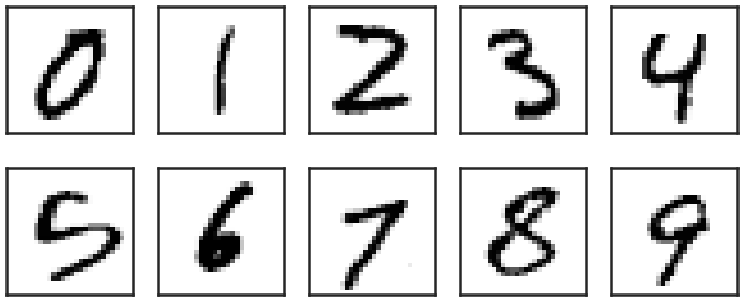
To start off, the data set of MNIST has a whole bunch of handwritten digits, a random sample of which looks like this:

The images are 28×28 pixels and every pixel has a value ranging from 0 to 255. All these 784 pixel values can be thought of as features of every image, and the corresponding labels of the images are the digits 0-9. As such machine learning models can be trained, to categorize the images into 10 categories, corresponding to the labels, based on 784 input variables. The labels in the data set are given.

Logistic regression can do this fairly well, and get roughly 92% of the labels right on images it has not seen while training the model (an independent test set), after being trained on about 50k such images. A neural network with one hidden layer (of 100 neurons, the default of the multi-layer perceptron model in scikit-learn) will get about  97.5% right, a significant improvement to the simple logistic regression. The same model with 3 hidden layers of 500, 200 and 50 neurons respectively will further improve that to 98%. When similar models are implemented in Tensorflow/Keras, with proper activation functions, will get about the same score. So far, so good, and this stuff is in basically every tutorial you have seen.

Let’s get beyond that!

Auto-encoders and bottleneck networks

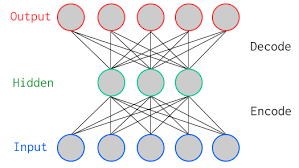
Auto-encoders are neural networks that typically use many input features, then go through a narrower hidden layer and then as output reproduce the input features. Graphically, it would look like this, with the output being identical to the input:

This means that, if the network performs well (i.e. if the input is reasonably well reproduced), all information about the images is stored into a smaller number of features (equal to the number of neurons in the narrowest hidden layer), which can be used as compression technique for example. It turns out that this also works very well to recover images from noisy variants of the images (the idea being that the network figures out the important bits, i.e. the actual image, from the unimportant, i.e. the noise pixels).

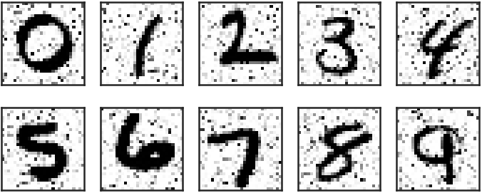
I created a set of noisy MNIST images looking, for 10 random examples, like this:

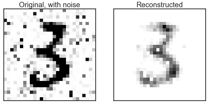
A simple auto-encoder, with hidden layers of 784, 256, 128, 256 and 784 neurons (note the symmetry around the bottleneck layer!), respectively does a fair job at reproducing noise-free images:

It’s not perfect, but it is clear that the “3” is much cleaner than it was before “de-noising”. A little comparison of recognizing the digits on noisy versus de-noised images shows that it pays to do such a pre-processing step before: the model trained on the clean images only recovers 89% of the correct labels on the noisy images, but 94% after de-noising (a factor 2 reduction in the number of wrongly identified labels). Note that all of this is done without any optimization of the model. The Kaggle competition page on this data set shows many optimized models and their amazing performance!

Dimension reduction and visualization

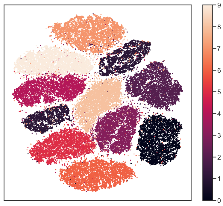
To investigate whether any structure exists in the data set of 784 pixels per image, people often, for good reasons, resort to manifold learning algorithms like t-SNE. Such algorithm go from 784 dimensions to, for example, 2, thereby keeping local structure intact as much as possible. A full explanation of such algorithms goes beyond the scope of this post, I will just show the result of it here. The 784 pixels are reduced to two dimensions and in this figure I plot those two dimensions against each other, color coded by the image label (so every dot is one image in the data set):

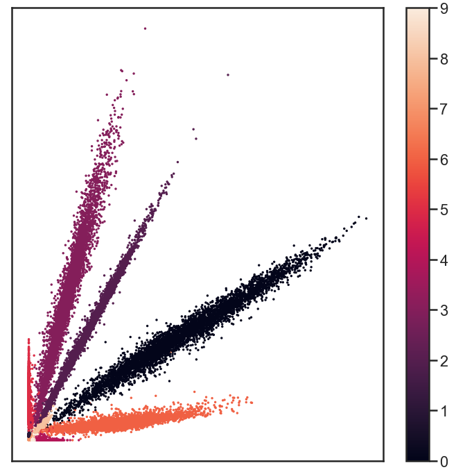
The labels seem very well separated, suggesting that reduction of dimensions can go as far as down to two dimensions, still keeping all the information to recover the labels to reasonable precision. This inspired me to try the same with a simple deep neural network. I go through a bottleneck layers of 2 neurons, surrounded by two layers of 100 neurons. Between the input and that there is another layer of 500 neurons and the output layer obvioulsy has 10 neurons. Note that this is not an auto-encoder: the output are the 10 labels, not the 784 input pixels. That network recovers more than 96% of the labels correctly! The output of the bottleneck layer can be visualized in much the same way as the t-SNE output:

It looks very different from the t-SNE results, but upon careful examination, there are similarities in terms if which digits are more closely together than others, for example. Again, this distinction is good enough to recover 96% of the labels! All that needs to be stored about images is 2 numbers, obtained from the encoding part of the bottleneck network, and using the decoding bit of the network, the labels can be recovered very well. Amazing, isn’t it?

Outlook

I hope I have shown you that there are a few simple steps beyond most tutorials that suddenly make these whole deep neural network exercises seem just a little bit more useful and practical. Are there applications of such networks that you would like to see worked out in some detail as well? Let me know, and I just might expand the notebook on github!