Data, Science & More

Test for COVID-19 in groups and be done much quicker!

In these times of a pandemic the world is changing. On large scales, but also for people in their every day lives. The same holds for me, so I figured I could post something on the blog again, to break with the habit of not doing so. Disclaimer: besides the exercises below being of almost trivial over-simplicity, I’m a data scientist and not an epidemiologist. Please believe specialists and not me!

Inspired by this blog post (in Dutch) I decided to look at simple versions of testing strategies for infection tests (a popular conversation topic nowadays), in a rather quick-and-dirty way. The idea is that if being infected (i.e. testing positive) is rare, you could start out by testing a large group as a whole. As it were, the cotton swabs of many people are put into one tube with testing fluid. If there’s no infection in that whole group you’re done with one test for all of them! If there, on the other hand, is an infection, you can cut the group in two and do the same for both halves. You can continue this process until you have isolated the few individuals that are infected.

It is clear, though, that many people get tested more than once and especially the infected people are getting tested quite a number of times. Therefore, this is only going to help if a relatively low number of people is infected. Here, I look at the numbers with very simple “simulations” (of the Monte Carlo type). Note that these are not very realistic, they are just meant to be an over-simplified example of how group testing strategy can work.

A graphical example of why this can work is given below (image courtesy of Bureau WO):

Above the line you see the current strategy displayed: everyobody gets one test. Below, the group is tested and after we found an infection, the group is cut in halves. Those halves are tested again and those halves with an infection gradually get cut up in pieces again. This leads, in the end, to the identification of infected people. In the mean time, parts of the data without infection are not split up further and everyone in those sections is declared healthy.

Normally, by testing people one by one, you would need as many tests as people to identify all infected people. To investigate the gain by group testing, I divide the number of tests the simulation needs by this total number. The number of people in a very large population that can be tested is a factor gain higher, given a maximum number of tests, like we have available in the Netherlands.

In this notebook, that you don’t need to follow the story, but that you can check out to play with code, I create batches of people. Randomly, some fraction gets assigned “infected”, the rest is “healthy”. Then I start the test, which I assume to be perfect (i.e. every infected person gets detected and there are no false positives). For different infection rates (true percentage overall that is infected), and for different original batch sizes (the size of the group that initially gets tested) I study how many tests are needed to isolate every single infected person.

In a simple example, where I use batches of 256 people (note that this conveniently is a power of 2, but that is not necessary for this to work), I assume a overall infected fraction of 1%. This is lower than the current test results in the Netherlands, but that is likely due to only testing very high risk groups. This results in a factor 8 gain, which means that with the number of tests we have available per day, we could test 8 times more people than we do now, if the 1% is a reasonable guess of the overall infection rate.

To get a sense of these numbers for other infection rates and other batch sizes I did many runs, the results of which are summarized below:

As can be seen, going through the hassle of group testing is not worth it if the true infected fraction is well above a percent. If it is below, the gain can be high, and ideal batch sizes are around 50 to 100 people or so. If we are lucky, and significantly less than a percent of people is infected, gains can be more than an order of magnitude, which would be awesome.

Obviously, group testing comes at a price as well. First of all, people need to be tested more than once in many cases (which requires test results to come in relatively quickly). Also, there’s administrative overhead, as we need to keep track of which batch you were in to see if further testing is necessary. Last, but certainly not least, it needs to be possible to test many people at once without them infecting each other. In the current standard setup, this is tricky, but given that testing is basically getting some cotton swab in a fluid, I’m confident that we could make that work if we want!

If we are unlucky, and far more than a percent of people are infected, different strategies are needed to combine several people in a test. As always, wikipedia is a great source of information for these.

And the real caveat… realistic tests aren’t perfect… I’m a data scientist, and not an epidemiologist. Please believe specialists and not me!

Stay safe and stay healthy!

Beyond the recognition of handwritten digits

There are many tutorials on neural networks and deep learning, that use the handwritten digits data set (MNIST) to show what deep learning can give you. It generally trains a model to recognize the digits and show it’s better than a logistic regression. Many such tutorials also say something about auto-encoders and how they should be able to pre-process images, for example to get rid of noise and improve recognition on noisy (and hence more realistic?) images. Rarely, though, is that worked out into any amount of detail.

This blog post is a short summary, and a full version with code and output is available at my github. Lazy me has taken some shortcuts: I have pretty much always used default values of all models I trained, I have not investigated how they can be improved by tweaking (hyper-)parameters and I have only used simple dense networks (while convolutional neural nets might be a very good choice for improvement in this application). In some sense, the model can only get better in a realistic setting. I have compared to simple but popular other models, and sometimes that comparison isn’t very fair: the training time of the (deep) neural network models often is much longer. It is nevertheless not very easy to define a “fair comparison”. That said, going just that little bit beyond the recognition of the handwritten set can be done as follows.

The usual first steps

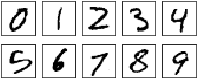
To start off, the data set of MNIST has a whole bunch of handwritten digits, a random sample of which looks like this:

The images are 28×28 pixels and every pixel has a value ranging from 0 to 255. All these 784 pixel values can be thought of as features of every image, and the corresponding labels of the images are the digits 0-9. As such machine learning models can be trained, to categorize the images into 10 categories, corresponding to the labels, based on 784 input variables. The labels in the data set are given.

Logistic regression can do this fairly well, and get roughly 92% of the labels right on images it has not seen while training the model (an independent test set), after being trained on about 50k such images. A neural network with one hidden layer (of 100 neurons, the default of the multi-layer perceptron model in scikit-learn) will get about  97.5% right, a significant improvement to the simple logistic regression. The same model with 3 hidden layers of 500, 200 and 50 neurons respectively will further improve that to 98%. When similar models are implemented in Tensorflow/Keras, with proper activation functions, will get about the same score. So far, so good, and this stuff is in basically every tutorial you have seen.

Let’s get beyond that!

Auto-encoders and bottleneck networks

Auto-encoders are neural networks that typically use many input features, then go through a narrower hidden layer and then as output reproduce the input features. Graphically, it would look like this, with the output being identical to the input:

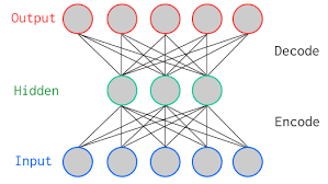
This means that, if the network performs well (i.e. if the input is reasonably well reproduced), all information about the images is stored into a smaller number of features (equal to the number of neurons in the narrowest hidden layer), which can be used as compression technique for example. It turns out that this also works very well to recover images from noisy variants of the images (the idea being that the network figures out the important bits, i.e. the actual image, from the unimportant, i.e. the noise pixels).

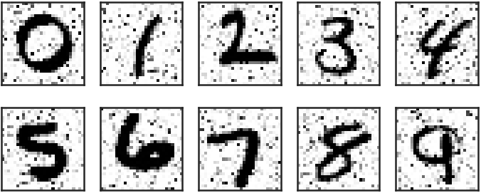
I created a set of noisy MNIST images looking, for 10 random examples, like this:

A simple auto-encoder, with hidden layers of 784, 256, 128, 256 and 784 neurons (note the symmetry around the bottleneck layer!), respectively does a fair job at reproducing noise-free images:

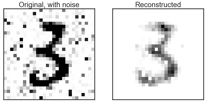
It’s not perfect, but it is clear that the “3” is much cleaner than it was before “de-noising”. A little comparison of recognizing the digits on noisy versus de-noised images shows that it pays to do such a pre-processing step before: the model trained on the clean images only recovers 89% of the correct labels on the noisy images, but 94% after de-noising (a factor 2 reduction in the number of wrongly identified labels). Note that all of this is done without any optimization of the model. The Kaggle competition page on this data set shows many optimized models and their amazing performance!

Dimension reduction and visualization

To investigate whether any structure exists in the data set of 784 pixels per image, people often, for good reasons, resort to manifold learning algorithms like t-SNE. Such algorithm go from 784 dimensions to, for example, 2, thereby keeping local structure intact as much as possible. A full explanation of such algorithms goes beyond the scope of this post, I will just show the result of it here. The 784 pixels are reduced to two dimensions and in this figure I plot those two dimensions against each other, color coded by the image label (so every dot is one image in the data set):

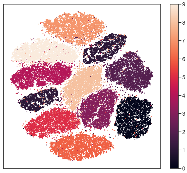
The labels seem very well separated, suggesting that reduction of dimensions can go as far as down to two dimensions, still keeping all the information to recover the labels to reasonable precision. This inspired me to try the same with a simple deep neural network. I go through a bottleneck layers of 2 neurons, surrounded by two layers of 100 neurons. Between the input and that there is another layer of 500 neurons and the output layer obvioulsy has 10 neurons. Note that this is not an auto-encoder: the output are the 10 labels, not the 784 input pixels. That network recovers more than 96% of the labels correctly! The output of the bottleneck layer can be visualized in much the same way as the t-SNE output:

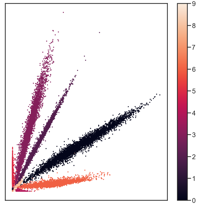
It looks very different from the t-SNE results, but upon careful examination, there are similarities in terms if which digits are more closely together than others, for example. Again, this distinction is good enough to recover 96% of the labels! All that needs to be stored about images is 2 numbers, obtained from the encoding part of the bottleneck network, and using the decoding bit of the network, the labels can be recovered very well. Amazing, isn’t it?

Outlook

I hope I have shown you that there are a few simple steps beyond most tutorials that suddenly make these whole deep neural network exercises seem just a little bit more useful and practical. Are there applications of such networks that you would like to see worked out in some detail as well? Let me know, and I just might expand the notebook on github!

Hacking for a future data flood

Astronomy has always been a “big data science”. Astronomy is an observational science: we just have to wait, watch, see and interpret what happens somewhere on the sky. We can’t control it, we can’t plan it, we can just observe in any kind of radiation imaginable and hope that we understand enough of the physics that governs the celestial objects to make sense of it. In recent years, more and more tools that are so very common in the world of data science have also penetrated the field of astrophysics. Where observational astronomy has largely been a hypothesis driven field, data driven “serendipitous” discoveries have become more commonplace in the last decade, and in fact entire surveys and instruments are now designed to be mostly effective through statistics, rather than through technology (even though it is still stat of the art!).

In order to illustrate how astronomy is leading the revolutions in data streams, this infographic was used by the organizers of a hackathon I went to nearing the end of April:
Streams and volumes of data!

The Square Kilometer Array will be a gigantic radio telescope that is going to result in a humongous 160 TB/s rate of data coming out of antennas. This needs to be managed and analysed on the fly somehow. At ASTRON a hackathon was organized to bring together a few dozen people from academia and industry to work on projects that can prepare astronomers for the immense data rates they will face in just a few years.

As usual, and for the better, smaller working groups split up and started working on different projects. Very different projects, in fact. Here, I will focus on the one I have worked on, but by searching for the right hash tag on twitter, I’m sure you can find info on many more of them!

ZFOURGE

We jumped on two large public data sets on galaxies and AGN (Active Galactic Nuclei: galaxies with a supermassive black hole in the center that is actively growing). One of them was a very large data set with millions of galaxies, but not very many properties of every galaxy (from SDSS), the other, out of which the coolest result (in my own, not very humble opinion) was distilled was from the ZFOURGE survey. In that data set, there are “only” just under 400k galaxies, but there were very many properties known, such as brightnesses through 39 filters, derived properties such as the total mass in stars in them, the rate at which stars were formed, as well as an indicator whether or not the galaxies have an active nucleus, as determined from their properties in X-rays, radio, or infrared.

I decided to try something simple and take the full photometric set of columns, so the brightness of the objects in many many wavelengths as well as a measure of their distance to us into account and do some unsupervised machine learning on that data set. The data set had 45 dimensions, so an obvious first choice was to do some dimensionality reduction on it. I played with PCA and my favorite bit of magic: t-SNE. A dimensionality reduction algorithm like that is supposed to reveal if any substructure in the data is present. In short, it tends to conserve local structure and screw up global structure just enough to give a rather clear representation of any clumping in the original high dimensional data set, in two dimensions (or more, if you want, but two is easiest to visualize). I made this plot without putting in any knowledge about which galaxies are AGN, but colored the AGNs and made them a bit bigger, just to see where they would end up:
t-SNE representation of galaxy data from ZFOURGE

To me, it was absolutely astonishing to see how that simple first try came up with something that seems too good to be true. The AGN cluster within clumps that were identified without any knowledge of the galaxies having an active nucleus or not. Many galaxies in there are not classified as AGN. Is that because they were simply not observed at the right wavelengths? Or are they observed but would their flux be just below detectable levels? Are the few AGN far away from the rest possible mis-classifications? Enough questions to follow up!

On the fly, we needed to solve some pretty nasty problems in order to get to this point, and that’s exactly what makes these projects so much fun to do. In the data set, there were a lot of null values, no observed flux in some filters. This could either mean that the observatory that was supposed to measure that flux didn’t point in the direction of the objects (yet), or that there was no detected flux above the noise. Working with cells that have no number at all or only upper limits on the brightness in some of the features that were fed to the machine learning algorithm is something most ML models are not very good at. We made some simple approximations and informed guesses about what numbers to impute into the data set. Did that have any influence on the results? Likely! Hard to test though… For me, this has sprung a new investigation on how to deal with ML on data with upper or lower limits on some of the features. I might report on that some time in the future!

The hackathon was a huge success. It is a lot of fun to gather with people with a lot of different backgrounds to just sit together for two days and in fact get to useful results, and interesting questions for follow-up. Many of the projects had either some semi-finished product, or leads into interesting further investigation that wouldn’t fit in two days. All the data is available online and all code is uploaded to github. Open science for the win!

SAS in a Pythonista’s workflow

Most who know me will probably know that I’m a major fan of Python in particular and open source software in general. Still, in my day job I use SAS quite a lot. Because I will be at the SAS Global Forum in Denver next week, I thought it would be a good time to write about the place of SAS in my work.


First of all, I can obviously not pay for the massive license fees of software like SAS, which also is my biggest objection to using it. So when I do anything on a freelance basis, it will be purely Python, in almost all assignments. In my day job I arrived, now 4,5 years ago, in a team that even was called the “SAS team”. Their main, and in fact for a long time only, tooling was SAS Base. After fighting for a good two years we do now have a decent Anaconda installation with a Jupyter Hub which makes for much faster data exploration, easier analytics and easier and much prettier visualization (no, SAS Visual Analytics is *not* a visualization tool, it’s a dashboarding tool, enormous difference).

Alright, so I can use Python and R and I still use SAS? Indeed I do. I think every tool is good for something. Part of our team is mainly occupied with ETL (extract, transform, load) work, building a good, stable, clean and well structured data warehouse that others (like me) can use at ease. For such work, SAS has some great tools. Moving data from a data base that is designed to make a particular application work smoothly into a data warehouse, that keeps track of the history of that data base as well is not a trivial task and keeping track of all relevant input data base changes is quite some work. This is done with SAS (by others) and results in a data warehouse stored in SAS data sets that I consequently use for data analysis, machine learning, you name it.

From a data warehouse in SAS tables, I find it easiest to do my data collection, merging, aggregation and all that prerequisite work one always needs for analytics in SAS as well. Most of my projects start with data wrangling in SAS, and when I get to a small number of tables that are ready for analysis, analytics or visualization, I move over to Python (where the fun starts).

Yes, I do have my strong opinions about many SAS tools, about SAS as a company, about how they work and about how the world (e.g. auditors, authorities) look at SAS versus how they look at software from the open source realms. Still, I use a tool that is good at what I need from it, if I have access to it. More and better interfacing between Python, R and SAS is well underway and I hope the integration between the two will only become smoother. Hoping that SAS would vanish from my world is just an utterly unrealistic view of the world.

Why upgrade your OS if you don’t need to?

Two weeks ago I had nothing to do on a Saturday afternoon. Geeky as I am, I thought “let’s upgrade Xubuntu” on my laptop. I was still on the 16.04 Long Term Support version and it is 2018 by now, after all. A month or so later the new LTS version, 18.04, would appear, but why wait? That afternoon I had nothing better to do; when the new version comes out, I probably will be occupied. As usual, I googled around about a version upgrade from 16.04 to 17.10 and was, by every single site I encountered on the topic, strongly advised not to try this. But alas, I’m as stubborn as data scientists get and went ahead anyway.

Ouch. There seemed to be no problem at all. The upgrade was fine, except for some small weird looking error from LibreOffice, which I hardly ever use anyway. Everything worked as it worked before, even with the same looks (then why would you upgrade, right?). I played a game of Go for a bit and then went and let all other software do their updates as well. The usual reboot went blazing fast. I was prompted for my password and then the shit hit the fan: black screen. Nothing. Light from under the keyboard, but that was the only sign of life.

That is when you all of a sudden need a second computer. In all my confidence I had not created a bootable USB stick before the upgrade, and I didn’t have an older one with me either. With a terribly slow and annoying Windows laptop I managed to create one and booted the laptop from that. All fine. Good, so let’s replace the new and corrupted OS with something from this stick. Apparently, when I previously had installed my laptop, there seemed to be no need for a mount point for /efi, and now there was. Annoyingly, this needed to be at the start of the partition table, screwing up pre-existing partitions on that disk. At that point I decided: alright, format the disk, decently partition the disk and a fresh install would make my dear laptop all young and fresh again. There are two SSDs in the machine, and there was a back up of my home on the second disk.

The new install works like a charm, and restoring a back up also calls for some more cleaning up. It all looks tidy again.

I know, not everybody will be a fan of the old-school conky stuff on the desktop, but it just tickles my inner nerd a bit (and I actually do use it to monitor the performance when something heavy is running, I sure like it better than a top screen!). Took a decent part of a day, altogether, so next time I might take the advise of fellow geeks a bit more seriously. On the other hand, after mounting the second disk and finding the backups intact, the short moment of relief is worth it.

Off we go with a clean machine!

Craft beer!


One of my major interests outside the geeky realms is craft beer. I’m an avid sampler, try to go to beer festivals whenever I can, open Untappd almost every day, and I sometimes tweet about beer under a different twitter handle than my own: @BeerTweep.


In Dutch I have written (and hope to wrote again soon!) content for Bierista. You may be too lazy to go look on that site, so here’s a list of the specific things I wrote on there (newest first):

Leaving the field: becoming an extronomer

I wrote the post below roughly 5 years ago now. I quit my academic job in astrophysics, turned to industry and became a data scientist. I might at some point write something about how I think about all of this now.

I have decided to quit astronomy and start a job in the ‘real world’

I give up on a dream. I thoroughly enjoy doing astronomy. I have time left on my current contract and am even fairly confident that after this and another limited number of temporary jobs, I could have gotten a more permanent job in the field at some time, somewhere. So why quit? The uncertainty in a career in astronomy is enormous. If you don’t belong to the very top, and I don’t, you will have to go with the flow and move to wherever the field wants you. Sometimes that will get you to a very nice place in every respect (as we had in Baltimore), sometimes the place to work is very nice, but the place to live less so (like our current situation) and without a doubt even less desirable combinations are possible. Not the biggest deal for a short term postdoc (though too bad if it really doesn’t work out), but where will this long sought-after tenure-track job take you? And when?

Everybody who has done it for a while knows it: living far away from family and good friends is not easy. You can and will build up a new social life (if you even care about a social life, which you should), but those close at heart will be far. Too far, often. Our daughter deserves to grow up among the love of her grandparents and the rest of her family, just as well as they deserve to witness Amy growing up. It is a choice that everyone has to make for him-/herself, but for me a career in astronomy does not outweigh this aspect of life.

Contrary to (too) many academics, I believe that jobs outside of academia can be equally interesting. In many jobs, the everyday activities are even very similar to those of an astronomer. I think I have landed such a job. I will work in data science and business intelligence at a relatively small scale health insurance provider. An example of a project could be to detect fraud in their databases of claims, doctors, hospitals etc. (automatically). In my opinion, that is intellectually as challenging as the questions I am working on in astronomy, with the additional benefit that more people than just a handful of colleagues care about what you do.

Doing astronomy is fun. Like me, many colleagues often describe it as getting paid for your hobby. I can now go back to doing it purely as a hobby. There are several projects I will try to stay involved in to some extent, and I have a couple of very small projects in mind that I still can do. One doesn’t need to be a professional astronomer to do something fun and remotely useful. As an extronomer, you can easily be an amateur astrophysicist as well.

There are many aspects of working in astronomy that I will miss. The friendly atmosphere, collegiality and informality are a bless. I have met many great friends, with whom I hope to stay in contact. On the other hand, I am very much looking forward to my new profession and old environment. Even though I will leave the field professionally, at heart and in my way of thinking I will always be an astronomer.

Fraude detecteren door vernuftige analyse

(This is a blog published on the website of my employer, thought it would make a fair placeholder, sorry about the Dutch).

De zorg is al duur zat. Elke extra euro die moet worden uitgegeven omdat een zorgverlener de regels buigt moet achterhaald, of liever nog voorkomen worden. Probleem is dat “die euro” dan wel gevonden moet worden en dat is geen sinecure. Dit komt door enerzijds het enorme volume aan declaraties dat een zorgverzekeraar krijgt van alle zorgverleners bij elkaar en anderzijds het feit dat fraudeurs slimme dingen bedenken om vooral niet op te vallen. Hoe sporen we bij DSW fraudeurs op?

Op zoek naar outliers

Naast de meer traditionele manieren om fraude op te sporen gebruiken we bij DSW ook analysetechnieken om in de grote bergen data die we hebben patronen te ontdekken die zouden kunnen wijzen op frauduleus of ander onwenselijk gedrag. De tandarts die in een jaar 20 vullingen legt bij een familielid of de psychiater die 40 uur per dag zegt te werken is natuurlijk gauw gevonden, maar de meeste boeven pakken het toch slimmer aan. Precies daarom moeten wij nog slimmer zijn!


Voor het detecteren van rotte appels in een fruitmand vol zorgverleners gaan we er over het algemeen van uit dat de grote meerderheid zich niet misdraagt. Dit betekent dat we kunnen zoeken naar zogenaamde “outliers”, personen of instanties die zich net even anders lijken te gedragen dan de norm. Een complicerende factor is dat wij als zorgverzekeraar altijd maar een deel van het gedrag van een zorgverlener kunnen controleren, namelijk alleen de zorg die gedeclareerd wordt voor die patiënten die toevallig bij ons verzekerd zijn. Bij sommige instanties is dat misschien wel 60% van de populatie of meer, maar bij de meesten toch duidelijk minder, en we weten niet eens hoeveel precies. We hebben dus eerst wat werk te verzetten om analyses te doen op grootheden die niet zo gevoelig zijn voor het marktaandeel van DSW, zoals bijvoorbeeld kosten per verzekerde.


De score opbouwen

Alleen controleren op een getal als de gemiddelde kosten per verzekerde dekt de lading ook niet. Als een kwaadwillende zorgverlener dan kleine bedragen declareert voor een hoop mensen, dan gaat hij zelfs lager eindigen in kosten per verzekerde (terwijl hij in het aantal mensen waarvoor iets declareert juist weer zou opvallen). We kijken daarom naar heel veel van dit soort graadmeters tegelijk. Zo bouwen we een “score” op die aangeeft op hoeveel van dit soort anomaliedetecties (en andere controles) een zorgverlener opvalt, en hoe sterk hij opvalt.

Naast het detecteren van grootheden waarop een zorgverlener opvalt door ander gedrag dan zijn/haar concurrenten, kunnen we ook kijken naar signalen van verzekerden (“ik heb die behandeling helemaal niet gehad”), naar simpele regels als “geamputeerde ledematen kun je niet meer breken” of zelfs naar (zakelijke) verbanden tussen verschillende zorgverleners waardoor lucratieve doch frauduleuze werkwijzen kunnen worden overgebracht van de doorgewinterde oplichter naar de crimineel in spe.

Verder onderzoek

Alle ingrediënten van een totaalscore zijn hard te maken met statistiek, wet- en regelgeving of andere afspraken. Door het tweaken van de opbouw van zo’n totaalscore maken we een lijst waarvan we toch met enige zekerheid wel kunnen zeggen dat er iets loos is. Wanneer dergelijke signalen zijn gegenereerd dan pakken andere afdelingen dit doorgaans op voor verder onderzoek. Hiervoor levert ons datateam uiteraard nog wel data en analyses aan, maar het initiatief voor het uiteindelijk aanpakken ligt dan in de handen van de afdelingen die dichter bij de dagelijkse gang van zaken van een zorgverlener staan.