What determines what I teach?

I very recently quit a teaching program that I have been part of for more than four years, to which I had a personal connection after all those years. Besides it being lucrative, it was also a program that was for a good part shaped by me and colleagues and which was fun and fulfilling to teach. Why quit, you might ask.

The program, consisting of modules for data scientists, analytics translators and managers/executives, was a collaboration between a consulting company, Ortec, and the Amsterdam Business School, a department of the University of Amsterdam that organizes a lot of executive education. The data scientist program was ruthlessly killed about a year ago, because of fierce competition from online platforms. Face-to-face education is more effective and in my opinion worthwhile, but if you can’t offer the right program for the right price, then it isn’t weird to decide not to. That so many people think you can learn such skills through watching a few videos and typing in two lines of code in a automatically checking code interpreter continues to amaze me and I bet we will see the devastating effects of this, now still junior, generation of Youtube data scientists in due time. But I digress.

The module for analytics translators is still alive and just these past few months I have still been teaching it. Fulfilling as always, I spent two half days in lecture rooms in hotels with a group of enthusiastic participants. The program this time was already rather different from what it had been before, and with the feedback of the current cohort, leadership decided to do another round of modifications.

Do not misunderstand me: continuously updating your educational offerings is what a good teacher does. Incorporating feedback from participants (or students) is crucial, as only they can properly judge whether your efforts help them reach their learning goals. One quote of the program director in the process made me scratch my head though:

I am just trying to design a program that I can sell.

Sure, selling your program is important, as otherwise there is no program. I get that. And for consulting companies (this program director is not with the consulting party in the collaboration) this may be the most or even only viable way of running business. I think, though, that people come to trusted educational institutions like universities for a different reason. A university does not design a curriculum for sales. It sets learning goals (which may well be (job-) market informed!) and then designs an educational pathway to best reach those goals. What people need to learn is determined by where they want to end up, not by what is a sexy set of courses that happens to be easily marketed.

Teachers are teaching what they teach for two reasons. Firstly, they want to convey knowledge and skills that they have to students who want to learn. They think about the right educational means to help the students gain the knowledge and master the skills. Secondly, they are specialists in the field in which they teach, which means that they understand like no other what is necessary to learn, before one can become a specialist in that field, too. Few astronomers truly enjoy the first-year linear algebra they need to master and rarely do psychologist enjoy their statistics classes in undergrad, but these happen to be crucial ingredients to grow into the field that you want to be part of.

Besides the communication between the various people in this program detoriating to levels that I didn’t want to accept anymore, the fact that the curriculum went from specialist-informed to marketing and sales opportunity informed was the straw that broke the camel’s back. I want to be a proud teacher. Proud teachers design a program that is the best they can do to help students reach meaningful goals. You are very welcome to set learning goals based on all kinds of arguments, including sales, but once the learning goals are set, you should trust the professional’s teaching experience to manufacture a great, fun, and helpful course or program. It will be better for everyone’s motivation.

PS. More on my new academic role soon, presumably!

New year? New career!

We’re at the start of 2023. It has almost become a habit for me to switch jobs about yearly, over the last few years. I have never intended it that way, but apparently I needed a few de-tours to find out where I wanted to go. I have not made it a secret that I regret quitting my astro career and I also have alluded to aspiring an academic career. My current job at the University of Amsterdam is adjacent to academia, and that was the whole reason I took it in the first place.

I have done fun projects, learned a lot about the ‘behind the scenes’ at universities and was a willingly active member in the interdisciplinary Data Science Center of the University of Amsterdam (UvA). Some things could have been better (“creating” demand for our work wasn’t overly successful, and support from IT for what we needed was consistently cut back to near zero budget), but I do not necessarily need to change jobs. With my leave, though, I have advised against replacing me by another Marcel. I think the money can be spent better, before another me would jump onto the Advanced Analytics bandwagon again at the UvA central administration. Thanks to all my colleagues at the UvA for an interesting and fun year and a half!

In the post that announced my current job, I described the road towards it, which included a second place in a race for an assistant professorship at a university medical center, shared with a computer science department. In a rather bizarre turn of events (details available off the record), I have eventually accepted an offer that is very comparable, and arguably even better than the position I was originally applying for. That means…

I’m proud to announce that as of Feb 1st, I’ll be an academic again!

I will be an assistant professor of data science in population health at the Leiden University Medical Center (LUMC) at their interdisciplinary campus in The Hague, where they also offer the Population Health Management MSc program.

I’m very excited to be giving a lot of serious education again, and to be doing research in a highly relevant field of science. I have very little network or track record in this field, so I expect to learn a whole lot! Keep an eye on this blog, I might be using it a bit more frequently again (no guarantees, though…). Here’s to a challenging, but fun 2023!

The bumpy road to academia’s side entrance

I have indicated already earlier on this blog that I miss academia, and that I wouldn’t mind moving back into an academic job. I have made some attempts recently and want to reflect on the process here. Spoiler alert: I’ll start a job at the University of Amsterdam very soon!

In my journey back into academic life I have also applied less successfully twice, and for reflection on that, it is probably useful to understand my boundary conditions:

  • I left my academic career in astrophysics now roughly 8 years ago and have not done any pure science since (at least not visibly).
  • I have few, too few papers from three years of postdoc. I left my postdoc position with no intention to go back, and therefore have just dropped all three first-author papers that were in the making on the spot. They were never and will never be published.
  • I am strongly geographically bound. I can commute, but I can not move. Hence, I am bound to local options.

I have spent these last 8 years on data science and gained a fair amount of experience in that field. All that experience is in applied work. I have not done any fundamental research on data science methodology, As an aside, I have of course learned a lot about software development and team work in companies of different sizes. I have seen the process of going from a Proof-of-Concept study to building actual products in a scalable, maintainable production environment (often in the cloud) up close, very close. Much of that experience could be very useful for academia. If I (and/or my collaborators) back then had worked with standards even remotely resembling what is common in industry, science would progress faster, it would suffer much less from reproducibility issues and it would be much easier to build and use science products for a large community of collaborators.

But I digress…. The first application for an assistant professorship connected closely to some of the work I have done in my first data science job. I spent 5,5 years at a healthcare insurance provider, where some projects were about the healthcare side of things, as opposed to the insurance business. The position was shared between a university hospital and the computer science institute. I applied and got shortlisted, to my surprise. After the first interview, I was still in the race, with only one other candidate left. I was asked to prepare a proposal for research on “Data Science in Population Health” and discussed the proposal with a panel. It needed to be interesting for both the hospital as well as for the computer scientists, so that was an interesting combination of people to please. It was a lot of fun to do, actually, and I was proud of what I presented. The committee said they were impressed and the choice was difficult, but the other candidate was chosen. The main reason was supposedly my lack of a recent scientific track record.

What to think of that? The lack of track record is very apparent. It is also, I think, understandable. I have a full time job next to my private/family life, so there is very little time to build a scientific track record. I have gained very relevant experience in industry, which in fact could help academic research groups as well, but you can’t expect people to build experience in a non-academic job and build a scientific track record on the side, in my humble opinion. I was offered to compete for a prestigious postdoc-like fellowship at the hospital for which I could fine-tune my proposal. I respectfully declined, as that was guaranteed to be short-term, after which I would be without a position again. In fact, I was proud to end with the silver medal here, but also slightly frustrated about the main reason for not getting gold. If this is a general pattern, things would look a little hopeless.

As part of my job, and as a freelancer, I have spent a lot of time and effort on educational projects. I developed training material and gave trainings, workshops and masterclasses on a large variety of data science-related topics, to a large variety of audiences. Some of those were soft skill trainings, some were hard skill. Most were of the executive education type, but some were more ‘academic’ as well. When at the astronomical institute at biking distance a job opening with the title “Teaching assistant professor” appeared I was more than interested. It seemed to be aimed at Early Career Scientists, with a very heavy focus on education and education management. Contrary to far most of the job openings I have seen at astronomical institutes, I did not have to write a research statement, nor did they ask for any scientific accomplishment (at least not literally in the ad, perhaps this was assumed to go without saying). They asked for a teaching portfolio, which I could fill with an amount of teaching that must have been at least on par with successful candidates (I would guess the equivalent of 6 ECTS per year, for 3 years on end, and some smaller, but in topic more relevant stuff before that) and with excellent evaluations all across. Whatever was left of the two pages was open for a vision on teaching, which I gladly filled up as well. Another ingredient that would increase my chances was that this role was for Dutch speaking applicants and that knowledge of the Dutch educational system was considered a plus. Score and score. That should have significantly narrowed the pool of competitors. In my letter, I highlighted some of the other relevant experience I gained, that I would gladly bring into the institute’s research groups.

Right about at the promised date (I was plenty impressed!), the email from the selection committee came in! “I am sorry that we have to inform you that your application was not shortlisted.” Without any explanation given, I am left to guess what was the main issue with my application here. I wouldn’t have been overly surprised if I wasn’t offered the job, but I had good hopes of at least a shortlist, giving me the opportunity to explain in person why I was so motivated, and in my view qualified. So, were they in fact looking for a currently practicing astronomer? Was research more important than the job ad made it seem? Is my teaching experience too far from relevant, or actually not (good) enough? Dare I even question whether even this job ad was actually aiming for top-tier researchers rather than for people with just a heart (and perhaps even talent) for teaching? It’s hard to guess what the main reason was, and I shouldn’t try. One thing I am reluctantly concluding from this application is that a job in professional astronomy is hard to get for somebody who has long left the field. I think this vacancy asked for experience and skills that match my profile very well, so not even being shortlisted says a lot to me. Perhaps that’s not grounded, but that’s how it goes with sentiment, I guess. Perhaps a dedicated data science job in astronomy is still feasible, who knows.

In September, I’ll join the University of Amsterdam.

But alas, as said, I have also applied successfully. Yay! The University of Amsterdam (UvA) had an opening for a lead data scientist in the department of policy and strategy. Working for, rather than in higher education was something that previously didn’t really occur to me, but this really sounds like an opportunity to do what I like to do and do well, in the field where my heart is. The UvA is putting emphasis on data literacy in education as well as (inter-disciplinary) research. Big part of the job will be to build and maintain a network inside and outside of the university with data science communities. The Amsterdam Data Science Center fosters research that uses data science methods and meets around the corner. I will strive to take a central, or at least very visible role in that Center and be very close to academic interdisciplinary research! I’m excited! In due time, I’ll report on my experience.

Test for COVID-19 in groups and be done much quicker!

In these times of a pandemic the world is changing. On large scales, but also for people in their every day lives. The same holds for me, so I figured I could post something on the blog again, to break with the habit of not doing so. Disclaimer: besides the exercises below being of almost trivial over-simplicity, I’m a data scientist and not an epidemiologist. Please believe specialists and not me!

Inspired by this blog post (in Dutch) I decided to look at simple versions of testing strategies for infection tests (a popular conversation topic nowadays), in a rather quick-and-dirty way. The idea is that if being infected (i.e. testing positive) is rare, you could start out by testing a large group as a whole. As it were, the cotton swabs of many people are put into one tube with testing fluid. If there’s no infection in that whole group you’re done with one test for all of them! If there, on the other hand, is an infection, you can cut the group in two and do the same for both halves. You can continue this process until you have isolated the few individuals that are infected.

It is clear, though, that many people get tested more than once and especially the infected people are getting tested quite a number of times. Therefore, this is only going to help if a relatively low number of people is infected. Here, I look at the numbers with very simple “simulations” (of the Monte Carlo type). Note that these are not very realistic, they are just meant to be an over-simplified example of how group testing strategy can work.

A graphical example of why this can work is given below (image courtesy of Bureau WO):

Above the line you see the current strategy displayed: everyobody gets one test. Below, the group is tested and after we found an infection, the group is cut in halves. Those halves are tested again and those halves with an infection gradually get cut up in pieces again. This leads, in the end, to the identification of infected people. In the mean time, parts of the data without infection are not split up further and everyone in those sections is declared healthy.

Normally, by testing people one by one, you would need as many tests as people to identify all infected people. To investigate the gain by group testing, I divide the number of tests the simulation needs by this total number. The number of people in a very large population that can be tested is a factor gain higher, given a maximum number of tests, like we have available in the Netherlands.

In this notebook, that you don’t need to follow the story, but that you can check out to play with code, I create batches of people. Randomly, some fraction gets assigned “infected”, the rest is “healthy”. Then I start the test, which I assume to be perfect (i.e. every infected person gets detected and there are no false positives). For different infection rates (true percentage overall that is infected), and for different original batch sizes (the size of the group that initially gets tested) I study how many tests are needed to isolate every single infected person.

In a simple example, where I use batches of 256 people (note that this conveniently is a power of 2, but that is not necessary for this to work), I assume a overall infected fraction of 1%. This is lower than the current test results in the Netherlands, but that is likely due to only testing very high risk groups. This results in a factor 8 gain, which means that with the number of tests we have available per day, we could test 8 times more people than we do now, if the 1% is a reasonable guess of the overall infection rate.

To get a sense of these numbers for other infection rates and other batch sizes I did many runs, the results of which are summarized below:

As can be seen, going through the hassle of group testing is not worth it if the true infected fraction is well above a percent. If it is below, the gain can be high, and ideal batch sizes are around 50 to 100 people or so. If we are lucky, and significantly less than a percent of people is infected, gains can be more than an order of magnitude, which would be awesome.

Obviously, group testing comes at a price as well. First of all, people need to be tested more than once in many cases (which requires test results to come in relatively quickly). Also, there’s administrative overhead, as we need to keep track of which batch you were in to see if further testing is necessary. Last, but certainly not least, it needs to be possible to test many people at once without them infecting each other. In the current standard setup, this is tricky, but given that testing is basically getting some cotton swab in a fluid, I’m confident that we could make that work if we want!

If we are unlucky, and far more than a percent of people are infected, different strategies are needed to combine several people in a test. As always, wikipedia is a great source of information for these.

And the real caveat… realistic tests aren’t perfect… I’m a data scientist, and not an epidemiologist. Please believe specialists and not me!

Stay safe and stay healthy!

Hacking for a future data flood

Astronomy has always been a “big data science”. Astronomy is an observational science: we just have to wait, watch, see and interpret what happens somewhere on the sky. We can’t control it, we can’t plan it, we can just observe in any kind of radiation imaginable and hope that we understand enough of the physics that governs the celestial objects to make sense of it. In recent years, more and more tools that are so very common in the world of data science have also penetrated the field of astrophysics. Where observational astronomy has largely been a hypothesis driven field, data driven “serendipitous” discoveries have become more commonplace in the last decade, and in fact entire surveys and instruments are now designed to be mostly effective through statistics, rather than through technology (even though it is still stat of the art!).

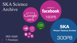
In order to illustrate how astronomy is leading the revolutions in data streams, this infographic was used by the organizers of a hackathon I went to nearing the end of April:
Streams and volumes of data!

The Square Kilometer Array will be a gigantic radio telescope that is going to result in a humongous 160 TB/s rate of data coming out of antennas. This needs to be managed and analysed on the fly somehow. At ASTRON a hackathon was organized to bring together a few dozen people from academia and industry to work on projects that can prepare astronomers for the immense data rates they will face in just a few years.

As usual, and for the better, smaller working groups split up and started working on different projects. Very different projects, in fact. Here, I will focus on the one I have worked on, but by searching for the right hash tag on twitter, I’m sure you can find info on many more of them!

ZFOURGE

We jumped on two large public data sets on galaxies and AGN (Active Galactic Nuclei: galaxies with a supermassive black hole in the center that is actively growing). One of them was a very large data set with millions of galaxies, but not very many properties of every galaxy (from SDSS), the other, out of which the coolest result (in my own, not very humble opinion) was distilled was from the ZFOURGE survey. In that data set, there are “only” just under 400k galaxies, but there were very many properties known, such as brightnesses through 39 filters, derived properties such as the total mass in stars in them, the rate at which stars were formed, as well as an indicator whether or not the galaxies have an active nucleus, as determined from their properties in X-rays, radio, or infrared.

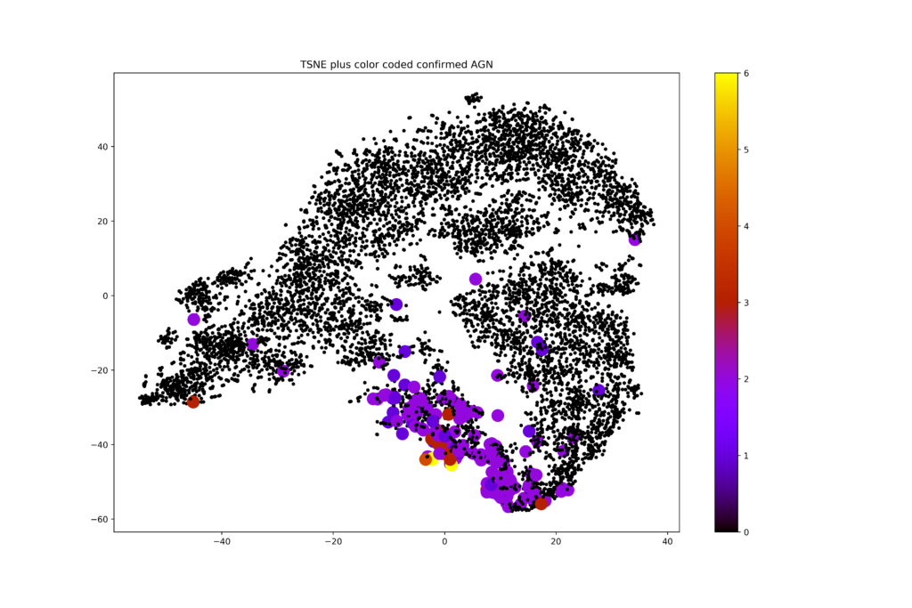
I decided to try something simple and take the full photometric set of columns, so the brightness of the objects in many many wavelengths as well as a measure of their distance to us into account and do some unsupervised machine learning on that data set. The data set had 45 dimensions, so an obvious first choice was to do some dimensionality reduction on it. I played with PCA and my favorite bit of magic: t-SNE. A dimensionality reduction algorithm like that is supposed to reveal if any substructure in the data is present. In short, it tends to conserve local structure and screw up global structure just enough to give a rather clear representation of any clumping in the original high dimensional data set, in two dimensions (or more, if you want, but two is easiest to visualize). I made this plot without putting in any knowledge about which galaxies are AGN, but colored the AGNs and made them a bit bigger, just to see where they would end up:
t-SNE representation of galaxy data from ZFOURGE

To me, it was absolutely astonishing to see how that simple first try came up with something that seems too good to be true. The AGN cluster within clumps that were identified without any knowledge of the galaxies having an active nucleus or not. Many galaxies in there are not classified as AGN. Is that because they were simply not observed at the right wavelengths? Or are they observed but would their flux be just below detectable levels? Are the few AGN far away from the rest possible mis-classifications? Enough questions to follow up!

On the fly, we needed to solve some pretty nasty problems in order to get to this point, and that’s exactly what makes these projects so much fun to do. In the data set, there were a lot of null values, no observed flux in some filters. This could either mean that the observatory that was supposed to measure that flux didn’t point in the direction of the objects (yet), or that there was no detected flux above the noise. Working with cells that have no number at all or only upper limits on the brightness in some of the features that were fed to the machine learning algorithm is something most ML models are not very good at. We made some simple approximations and informed guesses about what numbers to impute into the data set. Did that have any influence on the results? Likely! Hard to test though… For me, this has sprung a new investigation on how to deal with ML on data with upper or lower limits on some of the features. I might report on that some time in the future!

The hackathon was a huge success. It is a lot of fun to gather with people with a lot of different backgrounds to just sit together for two days and in fact get to useful results, and interesting questions for follow-up. Many of the projects had either some semi-finished product, or leads into interesting further investigation that wouldn’t fit in two days. All the data is available online and all code is uploaded to github. Open science for the win!

Fraude detecteren door vernuftige analyse

(This is a blog published on the website of my employer, thought it would make a fair placeholder, sorry about the Dutch).

De zorg is al duur zat. Elke extra euro die moet worden uitgegeven omdat een zorgverlener de regels buigt moet achterhaald, of liever nog voorkomen worden. Probleem is dat “die euro” dan wel gevonden moet worden en dat is geen sinecure. Dit komt door enerzijds het enorme volume aan declaraties dat een zorgverzekeraar krijgt van alle zorgverleners bij elkaar en anderzijds het feit dat fraudeurs slimme dingen bedenken om vooral niet op te vallen. Hoe sporen we bij DSW fraudeurs op?

Op zoek naar outliers

Naast de meer traditionele manieren om fraude op te sporen gebruiken we bij DSW ook analysetechnieken om in de grote bergen data die we hebben patronen te ontdekken die zouden kunnen wijzen op frauduleus of ander onwenselijk gedrag. De tandarts die in een jaar 20 vullingen legt bij een familielid of de psychiater die 40 uur per dag zegt te werken is natuurlijk gauw gevonden, maar de meeste boeven pakken het toch slimmer aan. Precies daarom moeten wij nog slimmer zijn!


Voor het detecteren van rotte appels in een fruitmand vol zorgverleners gaan we er over het algemeen van uit dat de grote meerderheid zich niet misdraagt. Dit betekent dat we kunnen zoeken naar zogenaamde “outliers”, personen of instanties die zich net even anders lijken te gedragen dan de norm. Een complicerende factor is dat wij als zorgverzekeraar altijd maar een deel van het gedrag van een zorgverlener kunnen controleren, namelijk alleen de zorg die gedeclareerd wordt voor die patiënten die toevallig bij ons verzekerd zijn. Bij sommige instanties is dat misschien wel 60% van de populatie of meer, maar bij de meesten toch duidelijk minder, en we weten niet eens hoeveel precies. We hebben dus eerst wat werk te verzetten om analyses te doen op grootheden die niet zo gevoelig zijn voor het marktaandeel van DSW, zoals bijvoorbeeld kosten per verzekerde.


De score opbouwen

Alleen controleren op een getal als de gemiddelde kosten per verzekerde dekt de lading ook niet. Als een kwaadwillende zorgverlener dan kleine bedragen declareert voor een hoop mensen, dan gaat hij zelfs lager eindigen in kosten per verzekerde (terwijl hij in het aantal mensen waarvoor iets declareert juist weer zou opvallen). We kijken daarom naar heel veel van dit soort graadmeters tegelijk. Zo bouwen we een “score” op die aangeeft op hoeveel van dit soort anomaliedetecties (en andere controles) een zorgverlener opvalt, en hoe sterk hij opvalt.

Naast het detecteren van grootheden waarop een zorgverlener opvalt door ander gedrag dan zijn/haar concurrenten, kunnen we ook kijken naar signalen van verzekerden (“ik heb die behandeling helemaal niet gehad”), naar simpele regels als “geamputeerde ledematen kun je niet meer breken” of zelfs naar (zakelijke) verbanden tussen verschillende zorgverleners waardoor lucratieve doch frauduleuze werkwijzen kunnen worden overgebracht van de doorgewinterde oplichter naar de crimineel in spe.

Verder onderzoek

Alle ingrediënten van een totaalscore zijn hard te maken met statistiek, wet- en regelgeving of andere afspraken. Door het tweaken van de opbouw van zo’n totaalscore maken we een lijst waarvan we toch met enige zekerheid wel kunnen zeggen dat er iets loos is. Wanneer dergelijke signalen zijn gegenereerd dan pakken andere afdelingen dit doorgaans op voor verder onderzoek. Hiervoor levert ons datateam uiteraard nog wel data en analyses aan, maar het initiatief voor het uiteindelijk aanpakken ligt dan in de handen van de afdelingen die dichter bij de dagelijkse gang van zaken van een zorgverlener staan.